Starting in December 2022, I worked with Atelier Keki, a small dessert business based in Lima, Peru. Its menu includes artisanal desserts inspired by French techniques and Japanese culture. The brand needed a website that was easy to navigate and visually engaging and that would allow customers to place online orders. In 3 months, I delivered a complete set of responsive website design and design system.
PROBLEM
At the moment, users place their orders via Whatsapp. There is a lot of back and forth between the customer and the business that could be alleviated through a more streamlined process.
GOAL
Design a website that would allow customers to visualize the desserts, read detailed information about the product, and find answers to the most commonly asked questions. Most importantly, they would be able to place orders on their own.
MY ROLE
UX designer from conception to delivery
TOOLS
Figma
Google Suite
Octopus
Miro
PROJECT DURATION
December 2022 - March 2023
Understanding the User
USER RESEARCH
Based on Atelier Keki's business model, I created a set of questions for potential users and focused on collecting qualitative data. I interviewed 6 individuals and these are the findings I took note of based on the answers received.
Instagram is the user’s main source, so having a strong social media presence is key.
Mobile phone is the preferred device for all users.
What users look for on a business website are: Hours & location, Product range - description, ingredients, and photos.
Being able to order the product online is important to users.
Websites need to be simple, easy to use, and helpful. Users lose interest if websites are too busy or don’t allow them to fulfill their tasks.
Users get frustrated with unresponsive websites and commonly have trouble with photos being too large and with having to scroll for too long when using a mobile device.
COMPETITIVE ANALYSIS
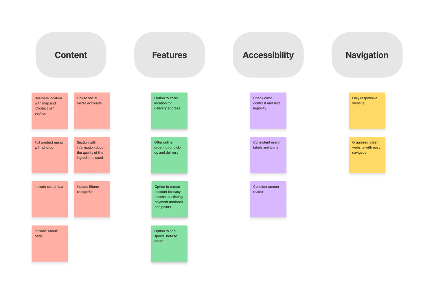
I conducted a competitive audit that allowed me to better understand the market our product would be entering. Two of the three direct competitors are powered by the same e-commerce platform, so their websites look very similar, almost generic. They are not fully responsive - some information gets lost on the mobile version, and scale and proportion could be re-evaluated. There is an opportunity to create a product that adapts better to the customer's experience.
There are key features that will be important to keep in mind and gaps that could definitely be filled in order to provide the user with a complete and informative product. These are the main points to consider:
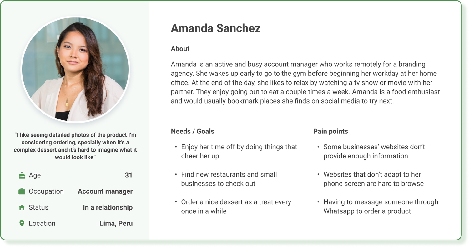
USER PERSONA
Amanda is a busy account manager who needs an informative yet easy source where she could order desserts from because she finds joy in treating herself.
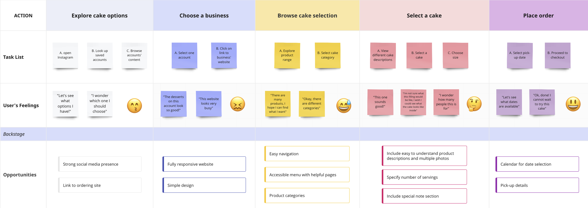
USER JOURNEY
Creating a user journey map allowed me to sympathize with the user’s emotions and identify potential pain points that could be addressed while developing Atelier Keki's website.
IDEATION
I did a quick ideation exercise to visualize a website that would address the gaps identified during the research stage. I focused on creating a visually appealing and straightforward user flow.
Starting the Design
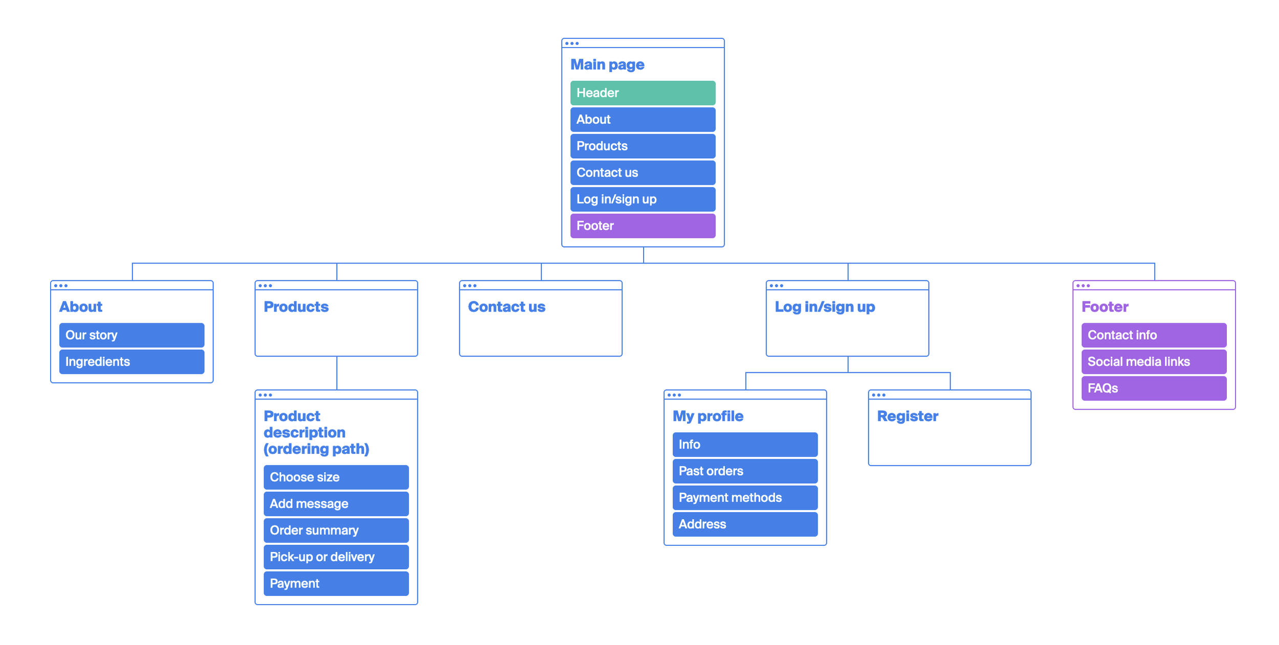
SITEMAP
Guided by the designs brainstormed during the ideation process, I created a sitemap to visualize the organization and content of each page.
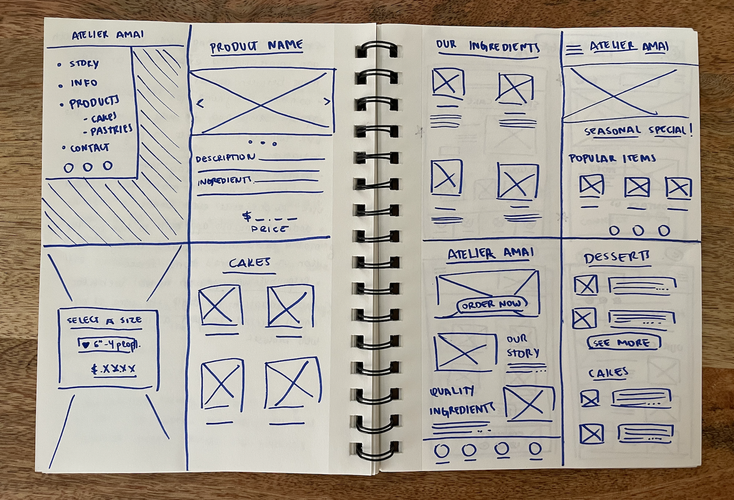
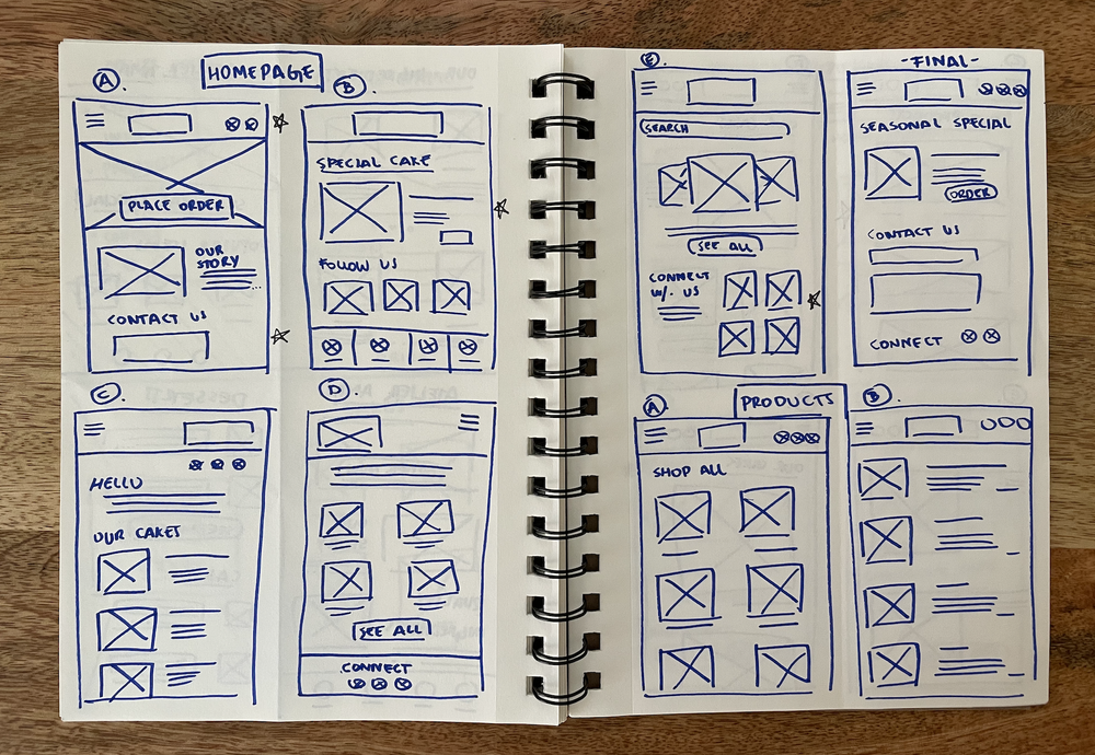
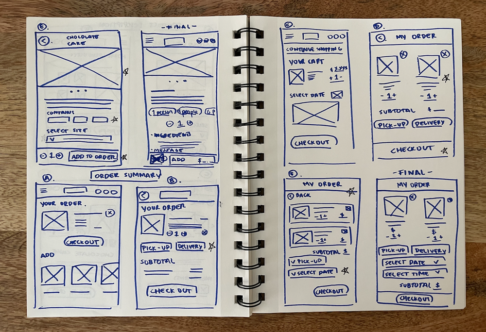
WIREFRAMES - FROM PAPER TO DIGITAL
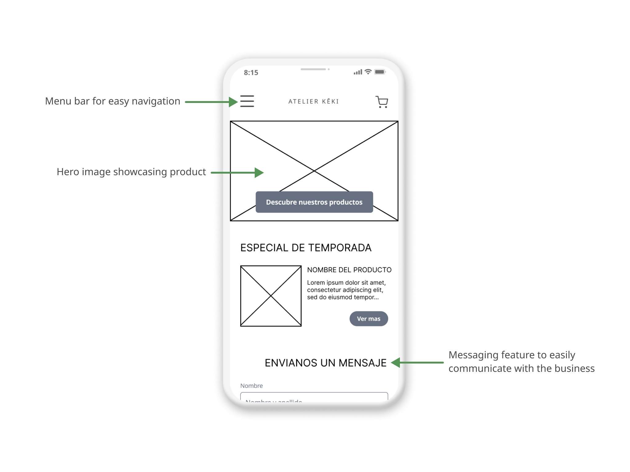
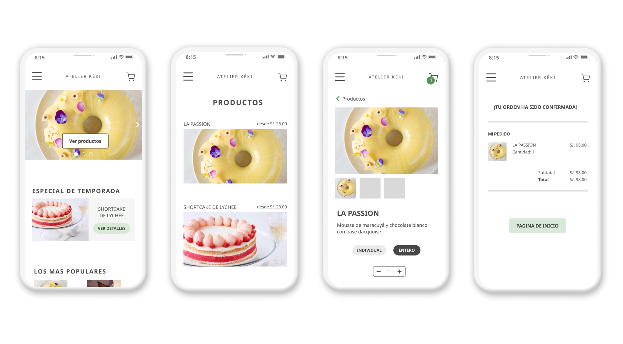
After brainstorming some paper wireframes, I created the initial designs for the website. These designs focused on showcasing Atelier Keki’s beautiful products and providing the user with all the necessary information to successfully place an order online. According to the data gathered from the initial research, mobile is the most popular device among our users, so I decided to start with that version.
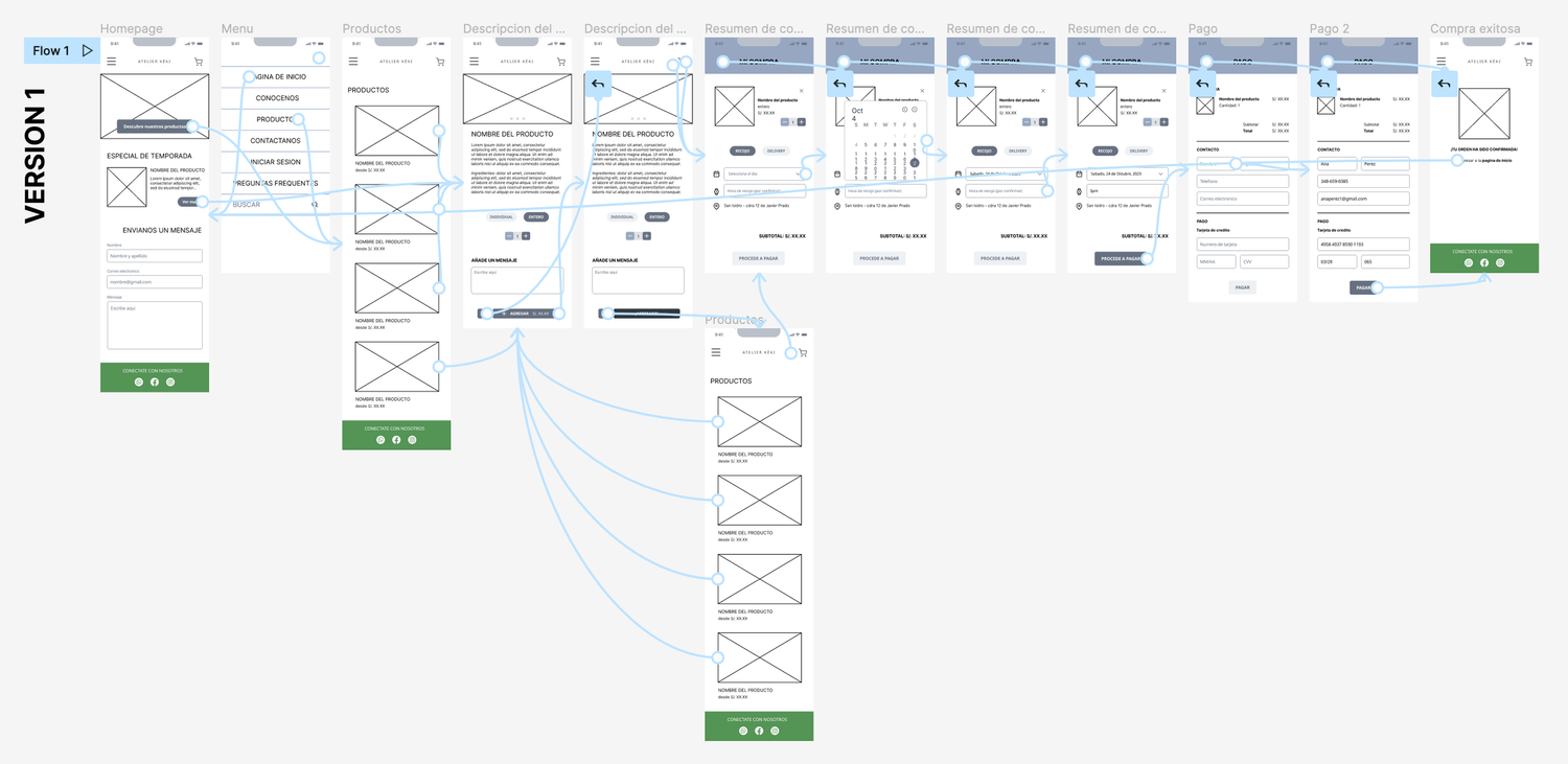
To prepare for usability testing, I created a low-fidelity prototype that connected the user flow of placing a dessert order online.
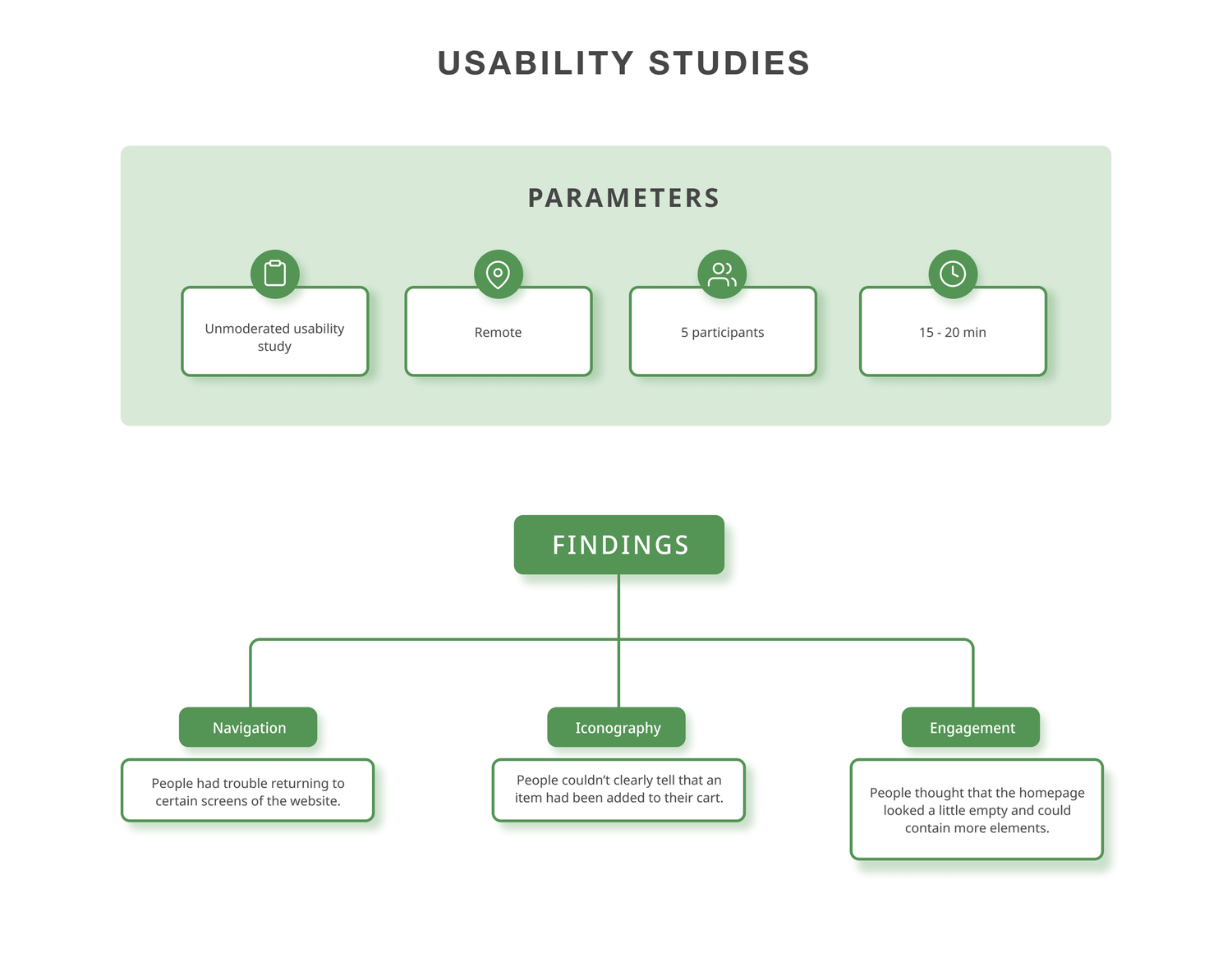
USABILITY STUDY
I conducted a round of usability studies to test the efficiency of the main user flow and overall IA before moving on to the next step.
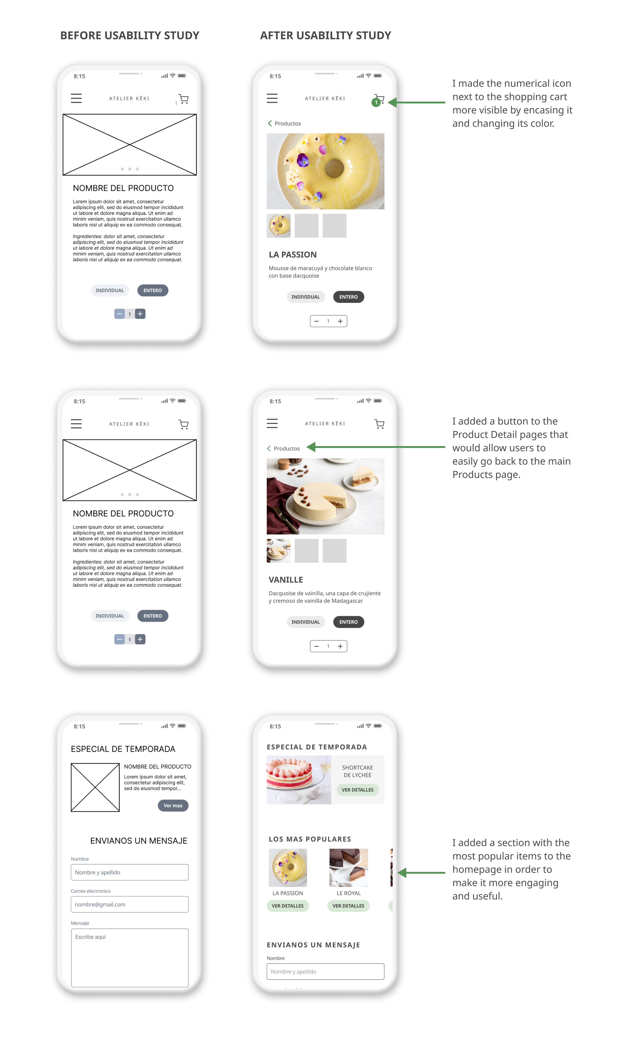
Refining the Design
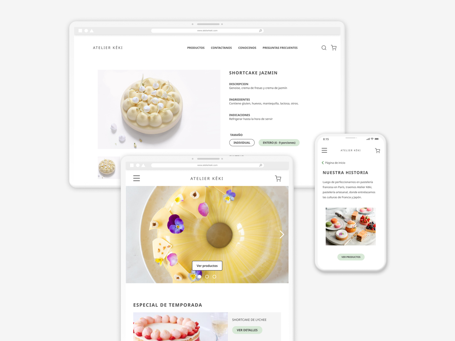
MOCKUPS
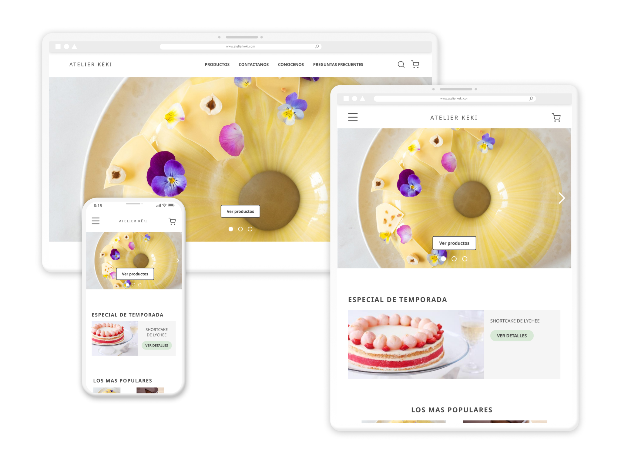
RESPONSIVE DESIGN
The designs for screen size variations included mobile, tablet, and desktop. I optimized the design to fit specific user needs of each device and screen size.
ACCESSIBILITY CONSIDERATIONS
I used different text sizes for headings consistently throughout the website for clear visual hierarchy.
Commonly known icons were used throughout for visual guidance. Text was added next to icons to make sure that it could be read by screen readers.
I tested the color combinations used to ensure that the contrast ratio met WCAG guidelines for accessible design using WebAIM's Contrast Checker tool.
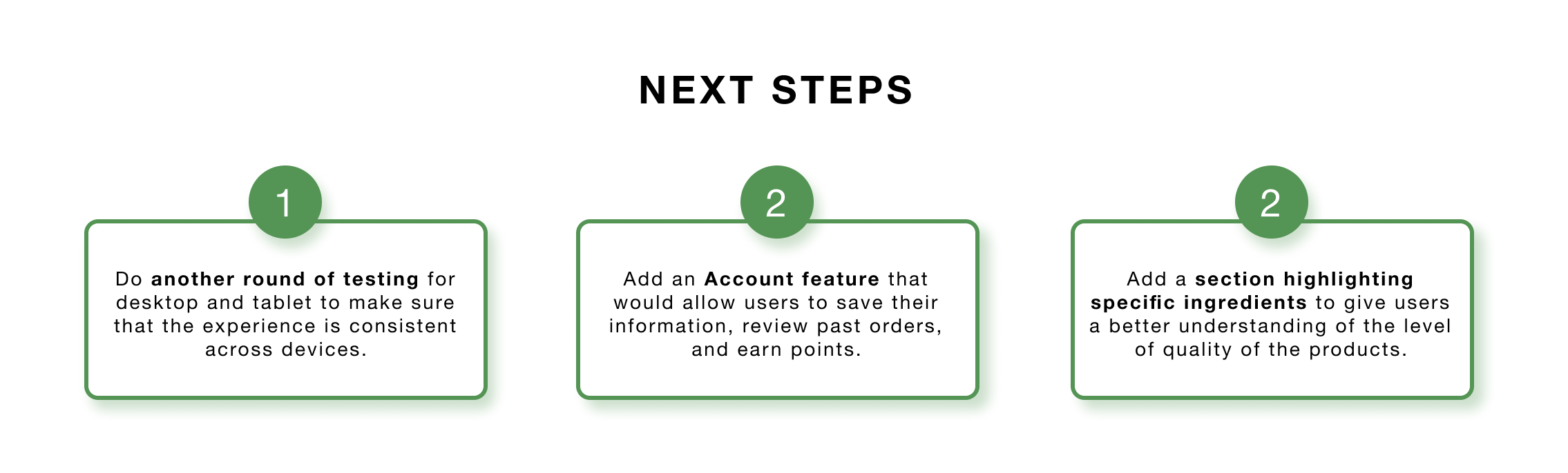
Going Forward
IMPACT
Users agreed that having a single source where they could browse through the products on detail and seamlessly place their orders made their experience easier and less tedious.
WHAT I LEARNED
Although I had a clear task from the get-go, going through the design process and having various rounds of testing allowed me to address small details that would be useful to the users when going through the main flow. One user shared:
“In terms of design, I really like it (the website). It looks clean and that makes the photos of the desserts the main focus.”
