PRODUCT
Moviepop is a modern movie theater company with three locations across New York City, each located in a different borough - Manhattan, Brooklyn, and Queens.
 View Moviepop prototype
Moviepop is a modern movie theater company with three locations across New York City, each located in a different borough - Manhattan, Brooklyn, and Queens.
Moviegoers would like to book their tickets, select their seats, and purchase snacks in advance to save time and effort.
Create a more pleasant movie theater experience by allowing moviegoers to complete all of these tasks ahead of time.
UX designer from conception to delivery
July 2022 - August 2022
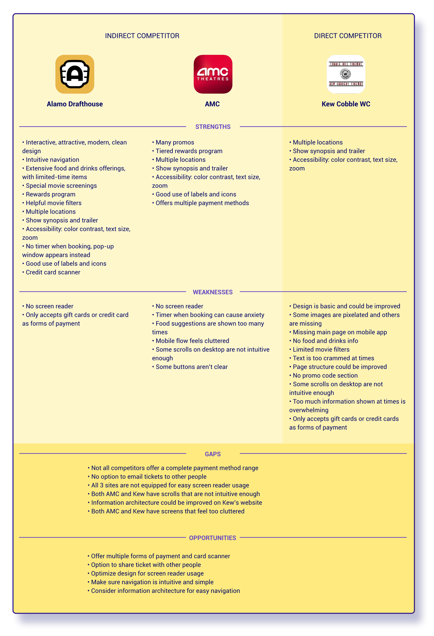
I conducted a competitive audit including both direct and indirect competitors to find gaps in the market that Moviepop could fill.
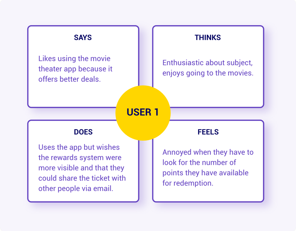
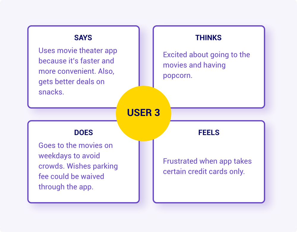
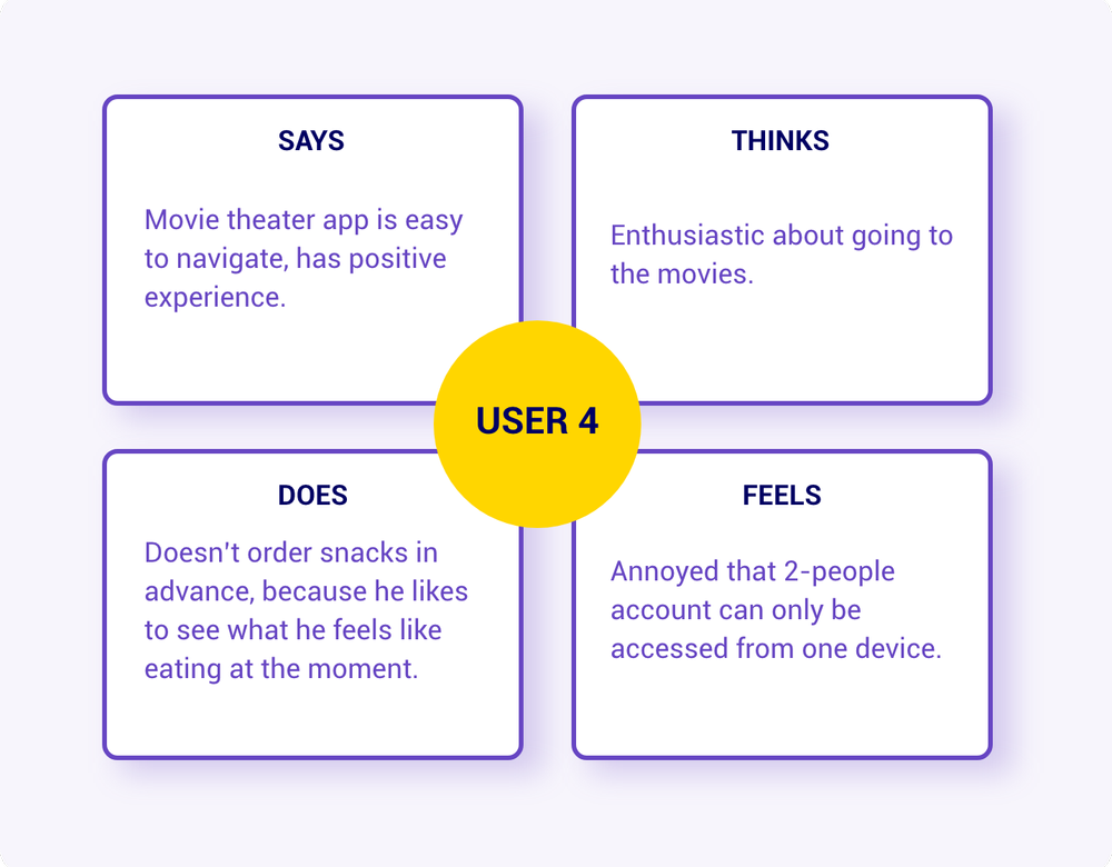
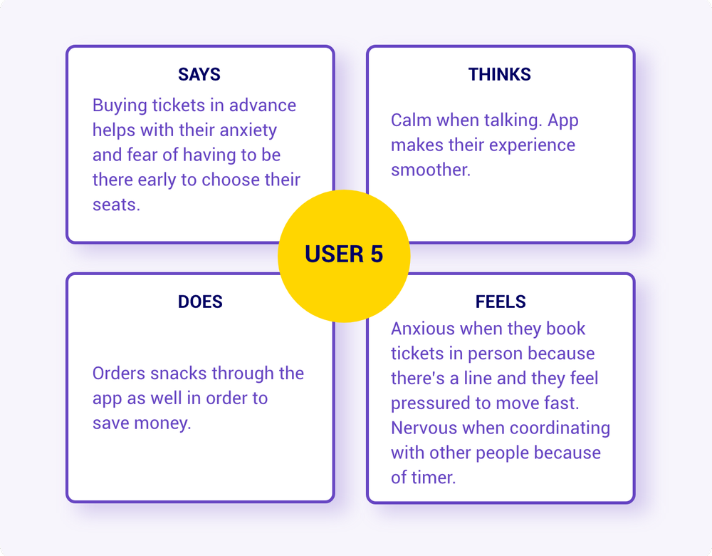
I conducted user interviews and then synthesized the information into empathy maps to have a better understanding of the users' thoughts. I found out that overall, users have a positive experience when going to the movies.
They value having the option to buy their tickets in advance because this allows them to plan their outing and prevents them from having to show up at the theater super early. It's also a big incentive when they're able to earn points and get rewarded. So, having a rewards system that's easy to access is key.
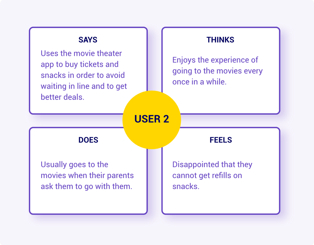
Buying tickets and snacks at the movie theater entails having to show up in advance and wait in line
Number of rewards points earned can be hard to find on some websites
Having the option to share the tickets with other people in their party would be helpful
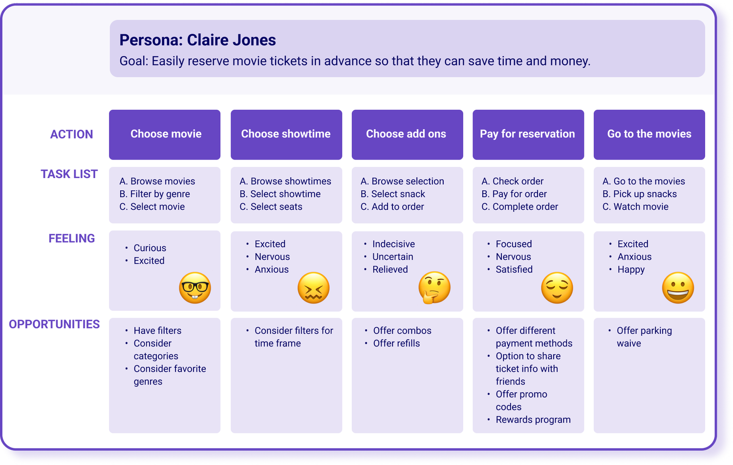
Claire is a busy media manager that loves superhero movies who needs to book tickets and snacks in advance because this saves them time when going to the theater.
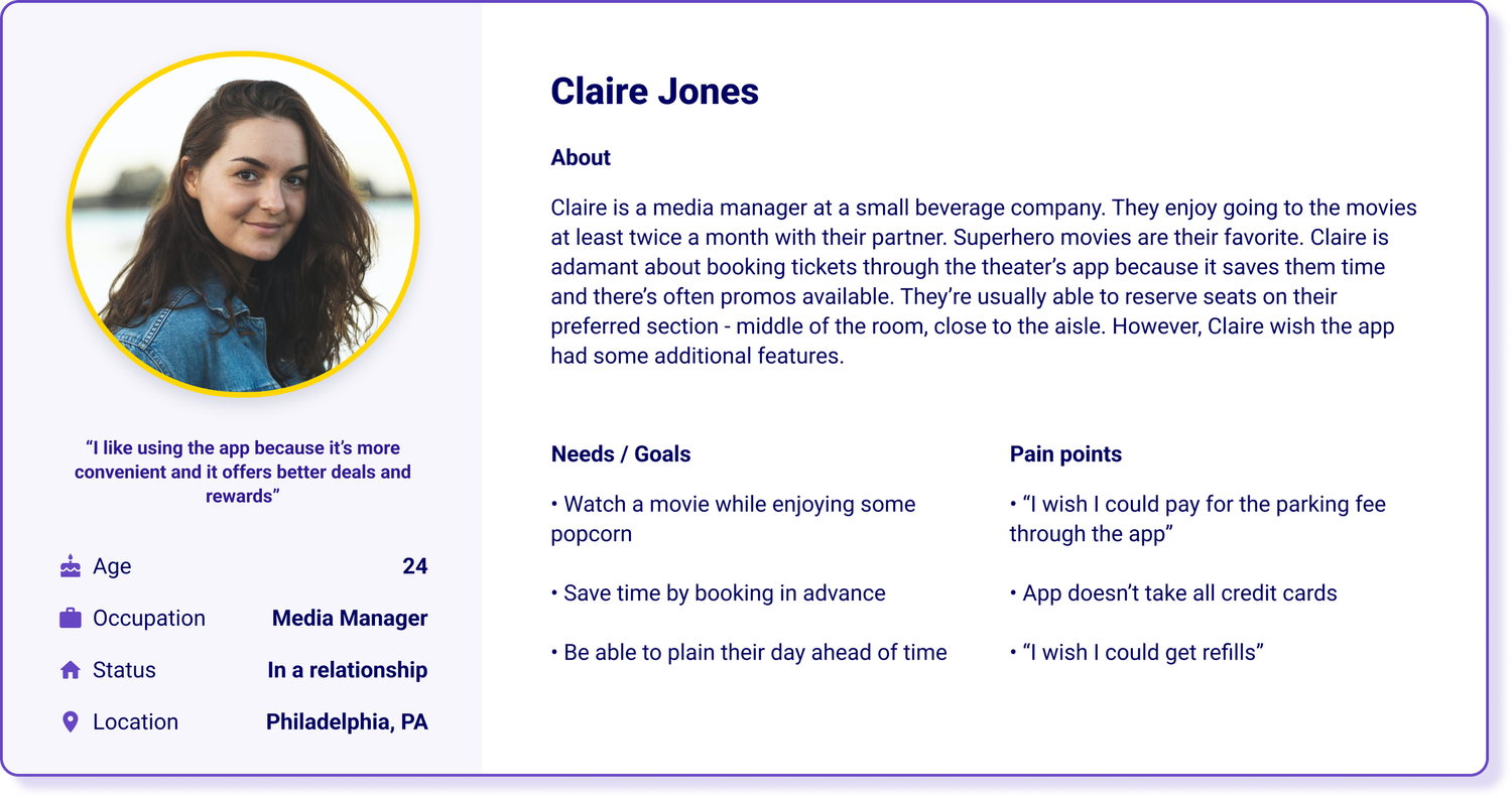
I created a user journey map for Claire's experience in order to identify possible pain points and potential features that could improve their experience.
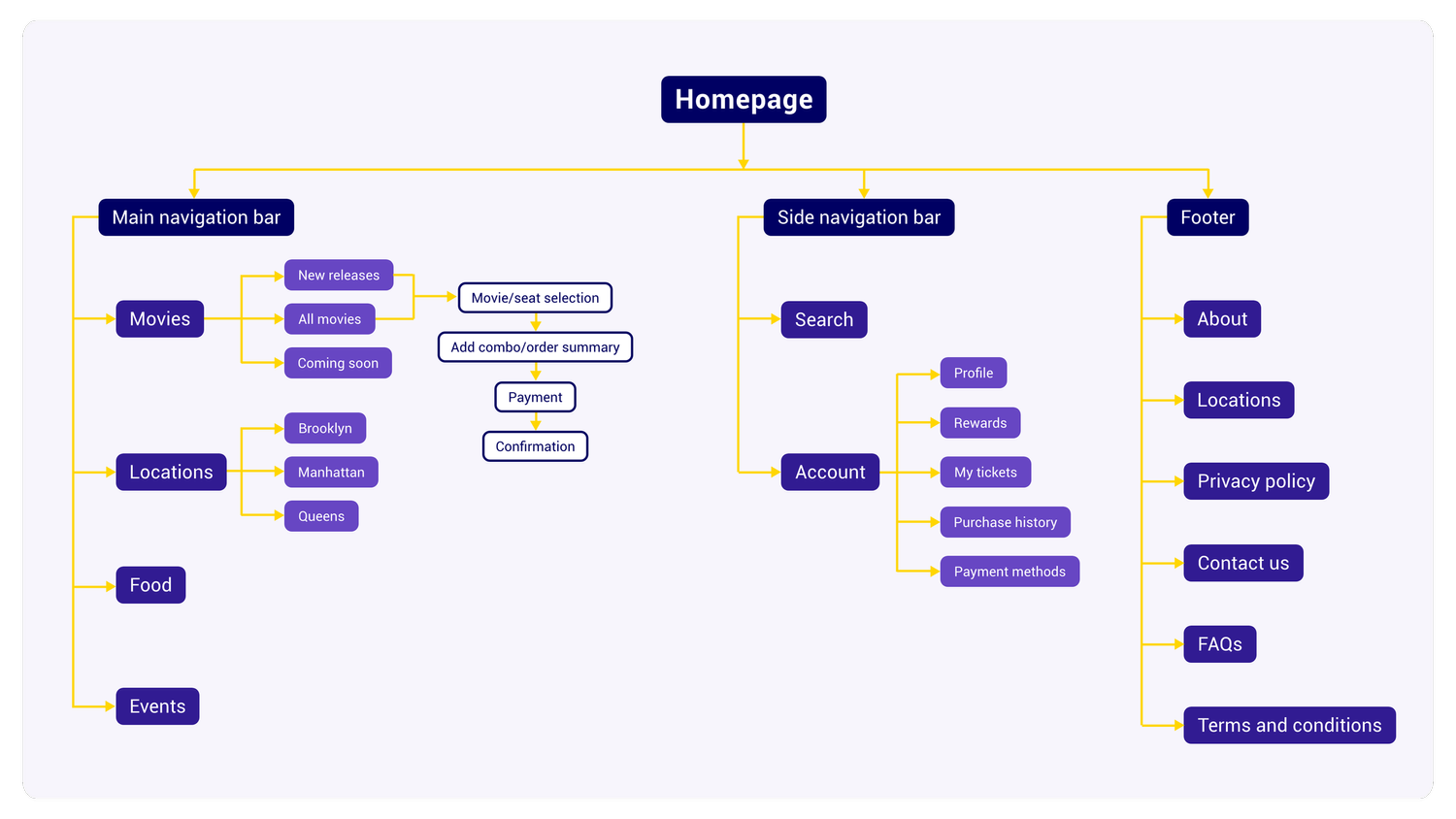
I created a sitemap by choosing and organizing all the information that's relevant to the user and that would be needed for a streamlined user flow. This will help me make sure specific categories are accessible for easy navigation.
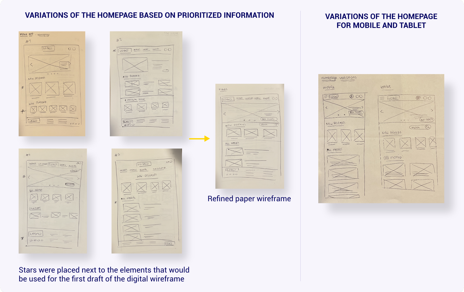
I sketched out paper wireframes for each screen of the website, keeping key features and the main user flow in mind.
Considering that users could access the Moviepop website from different types of devices, I sketched out some additional screens for mobile and tablet in order to have a site that would be fully responsive.
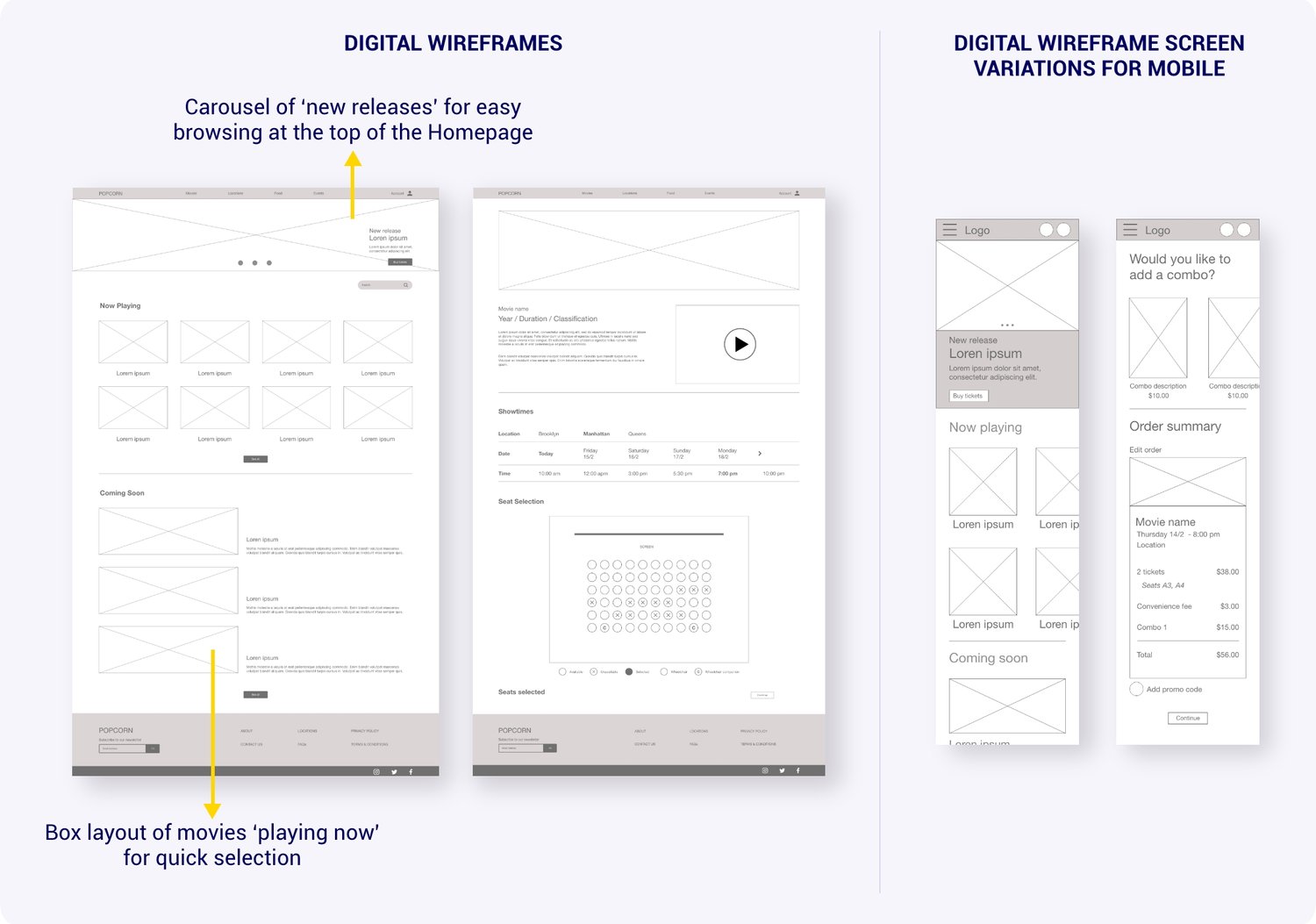
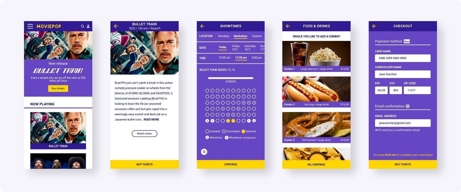
Moving on to digital wireframes, I prioritized the user's goal to easily book tickets online by playing around with scale and proportion, emphasizing the most important elements of the flow.
I then created responsive mobile wireframes for some of the screens. This allows for an optimized user experience across different devices. I made sure to keep all the information present but worked on different sizes and layouts that would make navigation easier on a smaller screen.
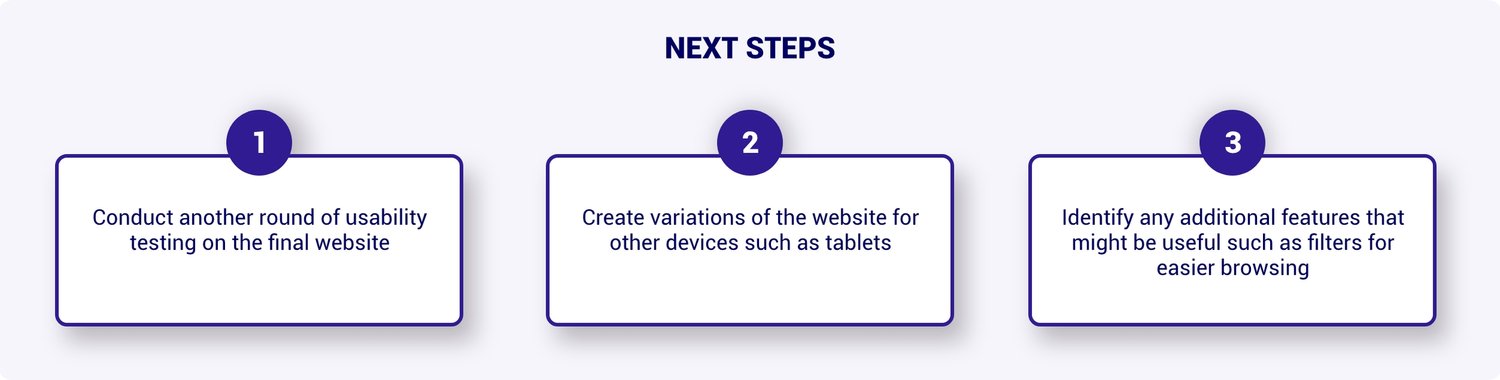
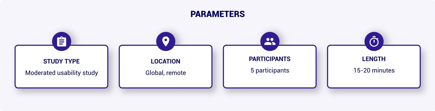
Next, I executed a usability study of the website to test the main user flow and to identify any additional features that might be missing. By synthesizing the collected data into affinity maps , I was able to identify parts of the flow where the user was getting stuck, thus needing improvement.
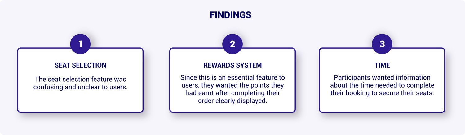
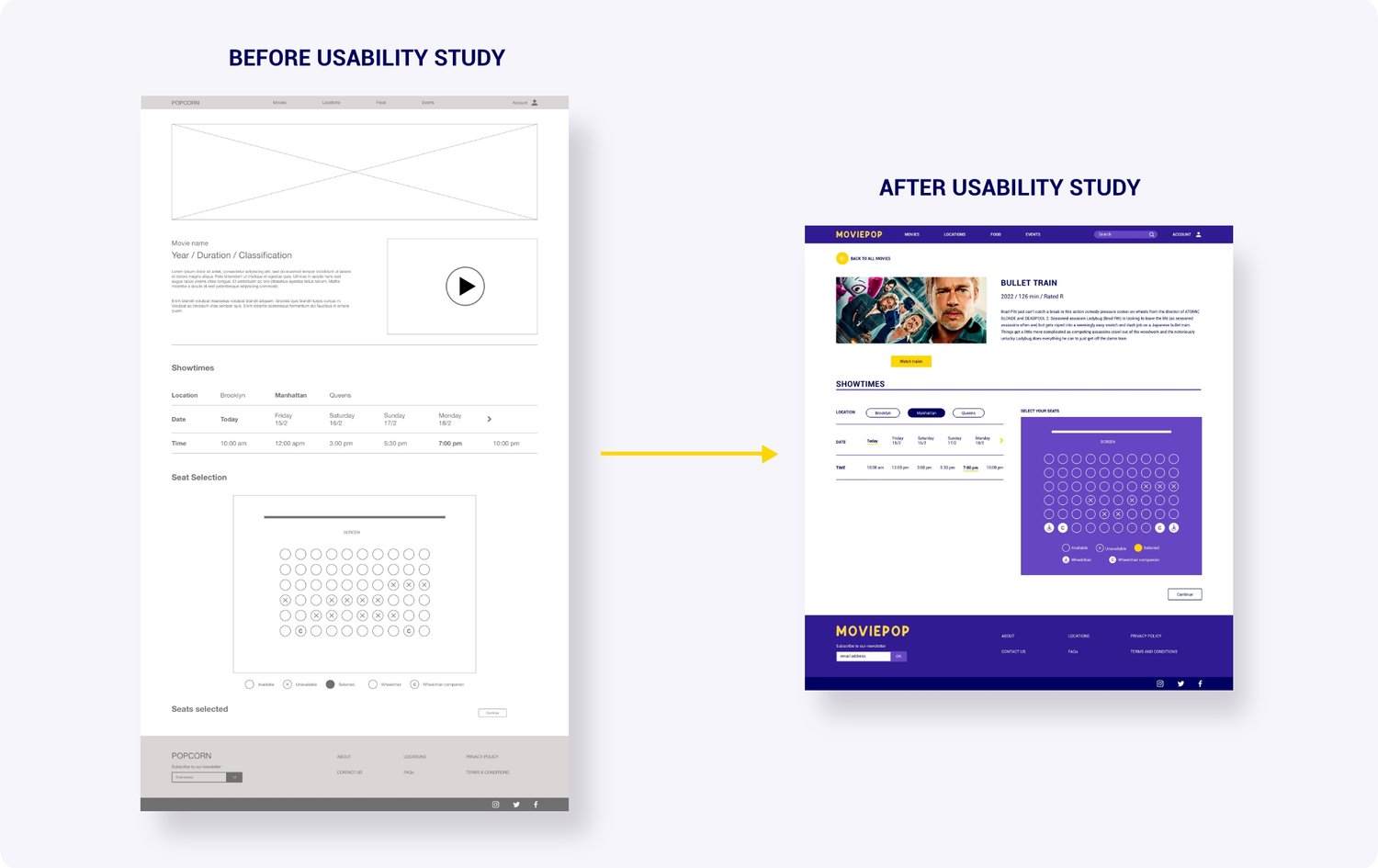
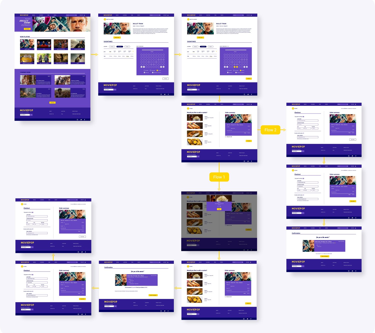
Based on the feedback received from the usability studies, I made some updates to the mockup that would improve the user experience. I relooked at scale and proportion and placed the 'Seat Selection' section next to the 'Showtimes' to make it easier for the user to understand the task to be completed on the screen. This way, users are also able to see the seats available for each showtime without having to scroll down.
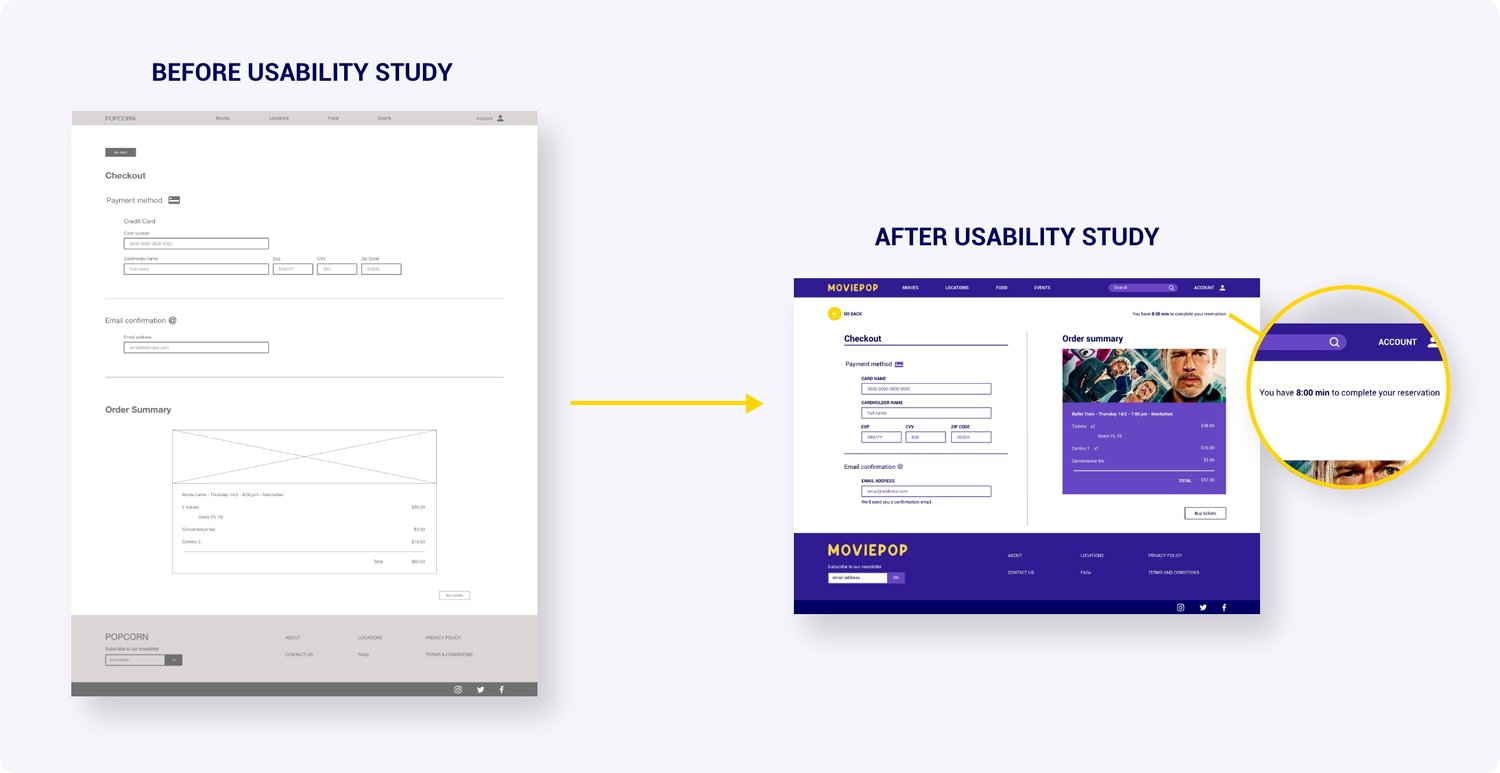
Also, users worried about the session expiring while completing their purchase, thus losing their selected seats, so I added a timer to the 'Checkout' page. This gives visibility to users over the time they have to successfully book their reservation.
I worked on mockups for the mobile version of the website based on the wireframes created earlier in the process. This would ensure that the website could adapt to a smaller screen in a way that would optimize the user's experience.
My high-fidelity prototype included the design changes made following the usability studies and an alternative user flow suggested by a team member.
The website design was easy to use and met the user's needs. Having features such as being able to add snacks to their order and earning rewards points made for a positive and rewarding user experience. One quote from user feedback:
“I think it makes sense, it's pretty intuitive.”
I learned that user testing is crucial when developing a website because it allows you to test your designs and often reconsider choices. It's important to always listen and be open to feedback and suggestions to create a product that genuinely solves users' pain points.